2. 파이썬 3.10 을 설치 https://www.python.org/downloads/release/python-3109/ 참고: https://cafe.daum.net/oracleoracle/Sp62/906
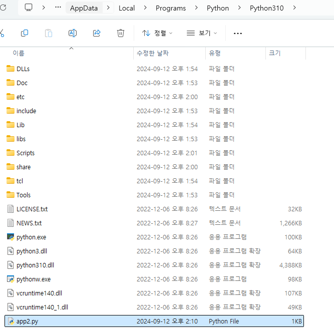
3.윈도우 탐색기를 열고 아래의 디렉토리로 이동
4. 명령 프롬프트창을 열고 위의 경로로 이동 5. pip install 명령어로 streamlit 을 설치
6. 명령 프롬프트창에서 한칸 뒤로 이동
7. streamlit 을 실행 안되면 다음과 같이 수행 8. 웹브라우져 하나가 자동으로 뜨는지 확인 9. plotting Demo 를 누르기
10.로컬 주피터 노트북에서 아래의 코드를 돌리기
!pip install vega_datasets
import altair as alt
from vega_datasets import data
import pandas as pd
import streamlit as st
emp = pd.read_csv("c:\\data\\emp.csv")
source = emp[['ename','sal']]
bars = alt.Chart(source).mark_bar().encode(
x='sal',
y="ename"
)
text = bars.mark_text(
align='left',
baseline='middle',
dx=3 # Nudges text to right so it doesn't appear on top of the bar
).encode(
text='sal'
)
a = (bars + text).properties(height=300)
a
#st.altair_chart(a, use_container_width=True)
11. 홈페이지에서 위의 화면이 출력되게 하기
아래의 스크립트를 메모장에 저장하고 app2.py 로 저장하는데 위치를 다음의 위치에 저장한다.
import altair as alt
#from vega_datasets import data
import pandas as pd
import streamlit as st
emp = pd.read_csv("c:\\data\\emp.csv")
source = emp[['ename','sal']]
bars = alt.Chart(source).mark_bar().encode(
x='sal',
y="ename"
)
text = bars.mark_text(
align='left',
baseline='middle',
dx=3 # Nudges text to right so it doesn't appear on top of the bar
).encode(
text='sal'
)
a = (bars + text).properties(height=500)
st.altair_chart(a, use_container_width=True)
도스창에서 위의 디렉토리로 이동해서 app2.py 를 실행한다.
나만의 홈페이지에 그래프가 잘 뜨는지 확인한다.
12. emp 테이블도 같이 출력한다.
import altair as alt
#from vega_datasets import data
import pandas as pd
import streamlit as st

emp = pd.read_csv("c:\\data\\emp.csv")
source = emp[['ename','sal']]

bars = alt.Chart(source).mark_bar().encode(
    x='sal',
    y="ename"
)

text = bars.mark_text(
    align='left',
    baseline='middle',
    dx=3  # Nudges text to right so it doesn't appear on top of the bar
).encode(
    text='sal'
)

a = (bars + text).properties(height=500)

st.dataframe(emp)  # Same as st.write(df)
st.altair_chart(a, use_container_width=True)
홈페이지에서 아래의 빨간색 네모 쪽을 클릭해서 rerurn 을 눌러서 코드를 홈페이지에 반영한다.
※ SQL 시간에 만들었던 money 데이터와 판다스 수업 마지막 여러 그래프를 한 화면에 보여주는 코드를 이용해서 다음과 같이 구현해봅니다.
import pandas as pd
import matplotlib.pyplot as plt
# 한글 폰트 설정: 한글 깨짐을 방지하기 위함
plt.rc('font', family='Malgun Gothic')
# 데이터 읽기
money = pd.read_csv("c:\\data\\money_data6.csv")
# 그래프 크기 설정
fig, ax = plt.subplots(figsize=(12, 8)) # plt.figure() 대신 여기서 크기 설정
# Matplotlib 그래프 생성
ax.plot(list(money['A_MONTH']), list(money['A_RATE']), color='red', marker='o')
# X축 눈금 설정
plt.xticks(tuple(money['A_MONTH']))
# 제목 설정
plt.title("America Rate", size=15)
# 그래프 시각화 (Jupyter Notebook에서)
plt.show()
# 메모리에서 그래프 닫기
plt.close(fig)
2. 홈페이지에서 띄우기
import plotly.express as px
import plotly
import streamlit as st
import pandas as pd
import matplotlib.pyplot as plt


# 한글 폰트 설정 : 한글 깨짐을 방지하기 위함
plt.rc('font', family='Malgun Gothic')

money = pd.read_csv("c:\\data\\money_data6.csv")

plt.figure(figsize = (12, 8))

fig, ax = plt.subplots()
ax.plot( list(money['A_MONTH']), list(money['A_RATE']), color = 'red', marker = 'o' )
plt.xticks(tuple(money['A_MONTH']))
plt.title("America Rate", size = 15 )

st.pyplot(fig)


 requirements.txt
0.00MB
money_data7.csv
0.00MB
money_data6.csv
0.00MB
app16.py
0.00MB
app2.py
0.00MB
app7.py
0.00MB
requirements.txt
0.00MB
money_data7.csv
0.00MB
money_data6.csv
0.00MB
app16.py
0.00MB
app2.py
0.00MB
app7.py
0.00MB


