오바 피팅(over fitting) ? - 훈련데이터에만 너무 최적화 되어서 학습된 상태 - 그래서 훈련 데이터에 대한 정확도는 높은데 테스트 데이터에 대한 정확도가 상대적으로 낮은 상태
언더피팅(under fitting) ? - 훈련 데이터의 정확도도 낮은 상태로 학습된 상태
※ knn 기본 코드 설명
# 필요한 패키지 설치 및 로드if (!require("ggplot2")) install.packages("ggplot2")
if (!require("ggforce")) install.packages("ggforce")
library(ggplot2)
library(ggforce)
# 데이터 정의
x <- c(1, 2, 4, 5, 6, 1)
y <- c(5, 6, 5, 2, 3, 7)
# 거리 계산 함수 정의
distance <- function(a, b) {
return(sqrt(sum((a - b)^2)))
}
# 거리 계산 및 temp 벡터 생성
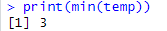
temp <- c() # 비어있는 벡터 temp 생성for (i in1:6) { # i가 1~6까지 반복하면서 아래의 실행문을 6번실행
temp <- append(temp, distance(c(x[i], y[i]), c(4, 4))) # 새로운 값 (4,4) 와의 거리를 구하기 위함
}
# 최소 거리 출력
min_distance <- min(temp)
cat("최소 거리:", min_distance, "\n") # 최소거리: 1# 데이터 프레임 생성
data <- data.frame(x = x, y = y, distance = temp)
# 원을 그릴 좌표와 반지름을 포함하는 데이터 프레임 생성
circle_data <- data.frame(x0 = 4, y0 = 4, r = 2.5)
# 시각화
ggplot(data, aes(x = x, y = y)) + # x축 데이터, y축 데이터
geom_point(aes(color = distance), size = 3) + # 산포도 그래프, size 는 점 크기
annotate("point", x = 4, y = 4, color = "red", size = 5, shape = 8) + # 점의 색깔
geom_text(aes(label = round(distance, 2)), vjust = -1.5, check_overlap = TRUE) + # 점위의 텍스트
scale_color_gradient(low = "blue", high = "red") + # 색상 그라데이데이션을 설정하기 위한 함수
ggtitle("Points and their Distances to (4, 4)") + # 그래프 제목
xlab("X") + # x 축 라벨
ylab("Y") + # y 축 라벨
theme_minimal() + # 전반적인 그래프의 분위기를 설정해주는 테마 함수
geom_circle(data = circle_data, aes(x0 = x0, y0 = y0, r = r), color = "red", inherit.aes = FALSE)
설명: C:\Program Files\R\R-4.4.1\library 패키지 위치
* append 함수를 이해하기 위한 코드
temp <- c() #temp라는 비어있는 벡터를 생성for ( i in1:6) { # i를 1~6까지 변경하며 반복하면서 아래의 실행문을 6번방법
temp <- append( temp,i ) # i가 1일때 c(1) 를 temp에 넣고
} # i가 2일때 c(2) 를 temp에 넣고 # ....# i가 6일때 c(1,2,3,4,5,6)이 완성됨
temp
문제. 유방암 환자의 양성 종양과 악성 종양의 분류를 KNN 머신어닝 알고리즘으로 분류하기
데이터설명: 위스콘신 유방암 진단 데이터셋이며 이 데이터는 569개의 암조직 검사예시가 들어있으며, 각 예시는 32개의 특징을 갖는다. (그 특징은 디지털 이미지에 존재하는 세포핵의 특성을 나타냅니다.)
1단계. 데이터 수집
#1. 데이터 로드 및 확인
wbcd <- read.csv('c:\\data\\wisc_bc_data.csv',stringsAsFactors = TRUE)
str(wbcd) # factor 형 변수 컬럼이 있는지 확인
nrow(wbcd) # 569행이 있음
ncol(wbcd) # 32열이 있음
viwe
2단계. 데이터 탐색
#2. 결측치 확인
colSums( is.na(wbcd) ) # 결측치가 없는 예쁜 데이터 입니다. # 결측치가 있다면 결측치를 다른 값으로 채워넣는 작업등을 해주어야합니다. #3. 종속변수의 데이터 비율 확인
table(wbcd$diagnosis) # B:357/M:212 - 수
prop.table(table(wbcd$diagnosis)) # B:0.6274165/M:0.3725835 - 비율(양성 60%/ 악성 40% )## 기계학습 시키기 제일 좋은 상태는 둘다 50%#4. 데이터 스케일링(최대최소 정규화)## 키와 체중이라는 독립변수가 있으면 키는 체중보다 숫자가 크므로 기계가 키가 더 중요하다고 오해할 수 있음## 따라서 모든 독립변수들을 0~1사이로 변경합니다.
wbcd2 <- wbcd[ ,c(-1,-2)] # 환자번호(id)와 정답컬럼(diagnosis)를 제외
wbcd2
normalize <- function(x){return((x-min(x))/(max(x)-min(x)))} # 최대 최소 정규화 함수
normalize
summary(wbcd2) # 데이터들이 중구난방함
wbcd_n <- as.data.frame(lapply(wbcd2,normalize)) #표준화화
summary(wbcd_n) # 데이터들이 0~1 사이로 바뀜뀜
3단계. 모델훈련 # 훈련 데이터와 테스트 뎅이터를 분리합니다. (90% 학습, 10% 실제시험)
set.seed(1) # 랜덤 난수를 생성할 때 어느 컴퓨터에서든 똑같은 난수가 생성될 수 있도록 지정
install.packages('caret')
library(caret)
train_indx <- createDataPartition(wbcd$diagnosis, p=0.9, list=FALSE)
train_indx # 총 569개중에 90% 에 해당하는 데이터 인덱스 번호를 랜덤으로 추출
wbcd$diagnosis[train_indx]# 90%의 데이터를 양성인지 악성인지 나옴옴length(wbcd$diagnosis[train_indx]) # 총 513개의 데이터가있음# 기계를 학습시킬 훈련 데이터와 테스트 데이터 생성
wbcd_train <- wbcd_n[train_indx, ] # 훈련 데이터
wbcd_test <- wbcd_n[-train_indx, ] # 테스트 데이터 생성
nrow(wbcd_train) # 513개
nrow(wbcd_test) # 56개# 기계를 학습시킬 훈련 데이터의 정답과 테스트 데이터의 정답 생성
wbcd_train_label <- wbcd$diagnosis[train_indx]
wbcd_test_label <- wbcd$diagnosis[-train_indx]
length(wbcd_train_label) # 513개length(wbcd_test_label) # 56개# knn 모델을 생성 및 예측
install.packages("class")
library(class)
result1 <- knn(train=wbcd_train,test=wbcd_test,cl=wbcd_train_label, k=1)
# 설명: knn(train=훈련 데이터, test = 테스트 데이터 , cl =훈련데이터 정답, k=최근접값)
result1
accuracies <- data.frame(k = integer(), accuracy = numeric())
for (i in seq(1, 27, 2)) {
  result1 <- knn(train = wbcd_train, test = wbcd_test, cl = wbcd_train_label, k = i)
  accuracy <- sum(result1 == wbcd_test_label) / length(wbcd_test_label) * 100
  accuracies <- rbind(accuracies, data.frame(k = i, accuracy = accuracy))
  print(paste(i, '개 일때 정확도 ', accuracy))
}
※ KNN 전체코드 합산
# 필요한 패키지 설치 및 로드if (!require("readr")) install.packages("readr")
if (!require("dplyr")) install.packages("dplyr")
if (!require("caret")) install.packages("caret")
if (!require("class")) install.packages("class")
if (!require("plotly")) install.packages("plotly")
library(readr)
library(dplyr)
library(caret)
library(class)
library(plotly)
# 1단계: 데이터 수집
wbcd <- read.csv("c:\\data\\wisc_bc_data.csv", stringsAsFactors = TRUE)
nrow(wbcd) # 569
ncol(wbcd) # 32# 2단계: 데이터 탐색# 1. 결측치 확인
colSums(is.na(wbcd))
# 2. 종속변수의 데이터 비율
table(wbcd$diagnosis)
prop.table(table(wbcd$diagnosis))
# 3. 데이터 스케일링 (최대최소 정규화)
wbcd2 <- wbcd[, c(-1, -2)] # 환자번호(id)와 정답컬럼(diagnosis)를 제외
normalize <- function(x) { return((x - min(x)) / (max(x) - min(x))) }
wbcd_n <- as.data.frame(lapply(wbcd2, normalize))
summary(wbcd_n)
# 3단계: 모델 훈련# 훈련 데이터와 테스트 데이터를 분리합니다. 90% 학습, 10% 시험
set.seed(10)
train_indx <- createDataPartition(wbcd$diagnosis, p = 0.9, list = FALSE)
# 기계를 학습 시킬 훈련 데이터와 테스트 데이터 생성
wbcd_train <- wbcd_n[train_indx, ]
wbcd_test <- wbcd_n[-train_indx, ]
nrow(wbcd_train) # 513
nrow(wbcd_test) # 56 # 기계를 학습 시킬 훈련 데이터의 정답과 테스트 데이터의 정답 생성
wbcd_train_label <- wbcd$diagnosis[train_indx]
wbcd_test_label <- wbcd$diagnosis[-train_indx]
length(wbcd_train_label) # 513length(wbcd_test_label) # 56# 4단계: 모델 성능 평가
accuracies <- data.frame(k = integer(), accuracy = numeric())
set.seed(10)
for (i in seq(1, 57, 2)) {
result1 <- knn(train = wbcd_train, test = wbcd_test, cl = wbcd_train_label, k = i)
accuracy <- sum(result1 == wbcd_test_label) / length(wbcd_test_label) * 100
accuracies <- rbind(accuracies, data.frame(k = i, accuracy = accuracy))
print(paste(i, '개 일때 정확도 ', accuracy))
}
# 정확도 데이터 프레임 확인
accuracies
# plotly로 라인 그래프 시각화
fig <- plot_ly(accuracies, x = ~k, y = ~accuracy, type = 'scatter', mode = 'lines+markers', line = list(color = 'red'))
fig <- fig %>% layout(title = "K 값에 따른 정확도",
xaxis = list(title = "K 값"),
yaxis = list(title = "정확도"))
fig
k= 7로 대입하여 결과확인.
# knn 모델을 생성 및 예측
install.packages("class")
library(class)

result1 <- knn(train=wbcd_train,test=wbcd_test,cl=wbcd_train_label, k=7)
# 설명: knn(train=훈련 데이터, test = 테스트 데이터 , cl =훈련데이터 정답, k=최근접값)
result1

sum(result1 ==wbcd_test_label) / length(wbcd_test_label)*100
문제. 와인 품종을 분류하는 머신러닝 모델을 생성하시오.
# 필요한 패키지 설치 및 로드if (!require("readr")) install.packages("readr")
if (!require("dplyr")) install.packages("dplyr")
if (!require("caret")) install.packages("caret")
if (!require("class")) install.packages("class")
if (!require("plotly")) install.packages("plotly")
library(readr)
library(dplyr)
library(caret)
library(class)
library(plotly)
# 1단계: 데이터 수집
wine <- read.csv("c:\\data\\wine2.csv", stringsAsFactors = TRUE)
nrow(wine) # 177
ncol(wine) # 14# 2단계: 데이터 탐색# 1. 결측치 확인
colSums(is.na(wine))
# 2. 종속변수의 데이터 비율
table(wine$Type)
prop.table(table(wine$Type)) # t1,t2,t3 의 데이터의 비율이 동일함# 3. 데이터 스케일링 (최대최소 정규화)
wine2 <- wine[, c(-1)] # 정답 type 제외
normalize <- function(x) { return((x - min(x)) / (max(x) - min(x))) }
wine2_n <- as.data.frame(lapply(wine2, normalize))
summary(wine2_n)
# 3단계: 모델 훈련# 훈련 데이터와 테스트 데이터를 분리합니다. 90% 학습, 10% 시험
set.seed(10)
train_indx <- createDataPartition(wine$Type, p = 0.9, list = FALSE)
train_indx
# 기계를 학습 시킬 훈련 데이터와 테스트 데이터 생성
wine_train <- wine2_n[train_indx, ]
wine_test <- wine2_n[-train_indx, ]
nrow(wine_train) # 161
nrow(wine_test) # 16# 기계를 학습 시킬 훈련 데이터의 정답과 테스트 데이터의 정답 생성
wine_train_label <- wine$Type[train_indx]
wine_test_label <- wine$Type[-train_indx]
length(wine_train_label) # 161length(wine_test_label) # 16# 4단계: 모델 성능 평가
accuracies <- data.frame(k = integer(), accuracy = numeric())
set.seed(10)
for (i in seq(1, 57, 2)) {
result1 <- knn(train = wine_train, test = wine_test, cl = wine_train_label, k = i)
accuracy <- sum(result1 == wine_test_label) / length(wine_test_label) * 100
accuracies <- rbind(accuracies, data.frame(k = i, accuracy = accuracy))
print(paste(i, '개 일때 정확도 ', accuracy))
}
# 정확도 데이터 프레임 확인
accuracies
# plotly로 라인 그래프 시각화
fig <- plot_ly(accuracies, x = ~k, y = ~accuracy, type = 'scatter', mode = 'lines+markers', line = list(color = 'red'))
fig <- fig %>% layout(title = "K 값에 따른 정확도",
xaxis = list(title = "K 값"),
yaxis = list(title = "정확도"))
fig
# knn 모델을 생성 및 예측
install.packages("class")
library(class)
result1 <- knn(train=wine_train,test=wine_test,cl=wine_train_label, k=1)
# 설명: knn(train=훈련 데이터, test = 테스트 데이터 , cl =훈련데이터 정답, k=최근접값)
result1
# 정확도 확인sum(result1 ==wine_test_label) / length(wine_test_label)*100
※ 머신러닝 모델을 활용하는 화면을 만드는 법 (RSHINY)
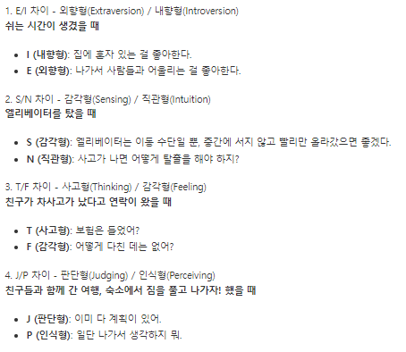
실습1. MBTI 검사하는 RSHINY 코드를 수행해보세요
1. MBTI 검사를 위한 데이터 준비
2. 위의 데이터로 R shiny 코드 작성
# 필요한 라이브러리 설치 및 로드if (!require("shiny")) install.packages("shiny")
library(shiny)
# UI 정의
ui <- fluidPage(
titlePanel("MBTI Predictor"),
fluidRow(
column(12,
h3("1. E/I 차이 - 외향형(Extraversion) / 내향형(Introversion)"),
p("쉬는 시간이 생겼을 때"),
radioButtons("extroversion", "당신의 선택은?",
choices = list("집에 혼자 있는 걸 좋아한다" = "I",
"나가서 사람들과 어울리는 걸 좋아한다" = "E"),
selected = character(0)),
h3("2. S/N 차이 - 감각형(Sensing) / 직관형(Intuition)"),
p("엘리베이터를 탔을 때"),
radioButtons("intuition", "당신의 선택은?",
choices = list("엘리베이터는 이동 수단일 뿐" = "S",
"사고가 나면 어떻게 탈출을 해야 하지?" = "N"),
selected = character(0)),
h3("3. T/F 차이 - 사고형(Thinking) / 감각형(Feeling)"),
p("친구가 차사고가 났다고 연락이 왔을 때"),
radioButtons("thinking", "당신의 선택은?",
choices = list("보험은 들었어?" = "T",
"어떻게 다친 데는 없어?" = "F"),
selected = character(0)),
h3("4. J/P 차이 - 판단형(Judging) / 인식형(Perceiving)"),
p("친구들과 함께 간 여행, 숙소에서 짐을 풀고 나가자! 했을 때"),
radioButtons("judging", "당신의 선택은?",
choices = list("이미 다 계획이 있어" = "J",
"일단 나가서 생각하지 뭐" = "P"),
selected = character(0)),
actionButton("predict", "Predict MBTI"),
actionButton("reset", "Reset"),
textOutput("mbtiResult")
)
)
)
# Server 정의
server <- function(input, output, session) {
observeEvent(input$predict, {
req(input$extroversion, input$intuition, input$thinking, input$judging)
mbti_type <- paste(input$extroversion, input$intuition, input$thinking, input$judging, sep = "")
output$mbtiResult <- renderText({
paste("당신의 MBTI 유형은:", mbti_type, "입니다.")
})
})
observeEvent(input$reset, {
updateRadioButtons(session, "extroversion", selected = character(0))
updateRadioButtons(session, "intuition", selected = character(0))
updateRadioButtons(session, "thinking", selected = character(0))
updateRadioButtons(session, "judging", selected = character(0))
output$mbtiResult <- renderText({ "" })
})
}
# Shiny 앱 실행
shinyApp(ui = ui, server = server)
(RSHINY 인터페이스 총정리)
library(shiny)

# Define UI ----
ui <- fluidPage(
  titlePanel("Basic widgets"),
  fluidRow(

    column(3,
           h3("Buttons"),
           actionButton("action", "Action"),
           br(),
           br(),
           submitButton("Submit")),

    column(3,
           h3("Single checkbox"),
           checkboxInput("checkbox", "Choice A", value = TRUE)),

    column(3,
           checkboxGroupInput("checkGroup",
                              h3("Checkbox group"),
                              choices = list("Choice 1" = 1,
                                             "Choice 2" = 2,
                                             "Choice 3" = 3),
                              selected = 1)),

    column(3,
           dateInput("date",
                     h3("Date input"),
                     value = "2014-01-01"))
  ),

  fluidRow(
    column(3,
           dateRangeInput("dates", h3("Date range"))),
    column(3,
           fileInput("file", h3("File input"))),
    column(3,
           h3("Help text"),
           helpText("Note: help text isn't a true widget,",
                    "but it provides an easy way to add text to",
                    "accompany other widgets.")),
    column(3,
           numericInput("num",
                        h3("Numeric input"),
                        value = 1))
  ),

  fluidRow(
    column(3,
           radioButtons("radio", h3("Radio buttons"),
                        choices = list("Choice 1" = 1, "Choice 2" = 2,
                                       "Choice 3" = 3),selected = 1)),

    column(3,
           selectInput("select", h3("Select box"),
                       choices = list("Choice 1" = 1, "Choice 2" = 2,
                                      "Choice 3" = 3), selected = 1)),

    column(3,
           sliderInput("slider1", h3("Sliders"),
                       min = 0, max = 100, value = 50),
           sliderInput("slider2", "",
                       min = 0, max = 100, value = c(25, 75))
    ),

    column(3,
           textInput("text", h3("Text input"),
                     value = "Enter text..."))
  )
)

# Define server logic ----
server <- function(input, output) {
}

# Run the app ----

shinyApp(ui = ui, server = server)
그림 출처 : https://apple-rbox.tistory.com/8
csv 파일을 직접 불러와서 화면에 테이블 형태로 출력하는 스크립트
library(DT) # 화면에 테이블 형태의 결과를 출력하기 위해 필요한 패키지
library(shiny) # 화면 인터 페이스 만드는 패키지
library(ggplot2)
# Define UI ----
ui <- fluidPage( # 샤이니의 사용자 인터페이스를 정의합니다.
titlePanel("EMP DataTable"), # 제목
fileInput("file1", "Choose CSV File", # 파일 업로드 입력기를 실행
multiple = TRUE, # 여러개의 파일을 한번에 업로드 할 수 있게
accept = c("text/csv", # 업로드 할 수 있는 파일 유형"text/comma-separated-values,text/plain",
".csv")), # 여기서는 CSV 파일만 허용됩니다.
DT::dataTableOutput("table") # 패키지이름::함수("변수")# dataTableOutput 이라는 함수는 data 를 화면에 뿌려주는 자바스크립트 함수입니다.
)
# Define server logic ----
server <- function(input, output) { # input 과 output 을 인자값으로 받습니다.
output$table <- DT::renderDataTable(DT::datatable({
req(input$file1) # input$file1 이 null 이 아니고 유효한 값인지를 확인하여
file1 = input$file1 # 아니면 파일 업로드를 계속 기다립니다.
data1 = read.csv(file1$datapath) # 업로드된 파일의 경로와 파일명
}))
}
# Run the app ----
shinyApp(ui = ui, server = server) # 샤이니 앱 실행
실습. iris의 꽃 품종을 분류하는 knn 모델을 생성하시오.
iris <- read.csv("c:\\data\\iris2.csv", stringsAsFactors=TRUE)
head(iris)
unique(iris$Species) #3개 (setosa, versicolor, virginica)# 필요한 패키지 설치 및 로드if (!require("readr")) install.packages("readr")
if (!require("dplyr")) install.packages("dplyr")
if (!require("caret")) install.packages("caret")
if (!require("class")) install.packages("class")
if (!require("plotly")) install.packages("plotly")
library(readr)
library(dplyr)
library(caret)
library(class)
library(plotly)
# 1단계: 데이터 수집
iris <- read.csv("c:\\data\\iris2.csv", stringsAsFactors=TRUE)
nrow(iris) # 150
ncol(iris) # 5# 2단계: 데이터 탐색# 1. 결측치 확인
colSums(is.na(iris))
# 2. 종속변수의 데이터 비율
table(iris$Species)
prop.table(table(iris$Species)) # t1,t2,t3 의 데이터의 비율이 동일함# 3. 데이터 스케일링 (최대최소 정규화)
iris2 <- iris[, c(-5)] # 정답 type 제외
iris2
normalize <- function(x) { return((x - min(x)) / (max(x) - min(x))) }
iris_n <- as.data.frame(lapply(iris2, normalize))
summary(iris_n)
# 3단계: 모델 훈련# 훈련 데이터와 테스트 데이터를 분리합니다. 90% 학습, 10% 시험
set.seed(10)
train_indx <- createDataPartition(iris$Species, p = 0.9, list = FALSE)
train_indx
# 기계를 학습 시킬 훈련 데이터와 테스트 데이터 생성
iris_train <- iris_n[train_indx, ]
iris_test <- iris_n[-train_indx, ]
nrow(iris_train) # 135
nrow(iris_test) # 15# 기계를 학습 시킬 훈련 데이터의 정답과 테스트 데이터의 정답 생성
iris_train_label <- iris$Species[train_indx]
iris_test_label <- iris$Species[-train_indx]
length(iris_train_label) # 135length(iris_test_label) # 15# 4단계: 모델 성능 평가
accuracies <- data.frame(k = integer(), accuracy = numeric())
set.seed(10)
for (i in seq(1, 57, 2)) {
result1 <- knn(train = wine_train, test = wine_test, cl = wine_train_label, k = i)
accuracy <- sum(result1 == wine_test_label) / length(wine_test_label) * 100
accuracies <- rbind(accuracies, data.frame(k = i, accuracy = accuracy))
print(paste(i, '개 일때 정확도 ', accuracy))
}
# 정확도 데이터 프레임 확인
accuracies
# plotly로 라인 그래프 시각화
fig <- plot_ly(accuracies, x = ~k, y = ~accuracy, type = 'scatter', mode = 'lines+markers', line = list(color = 'red'))
fig <- fig %>% layout(title = "K 값에 따른 정확도",
xaxis = list(title = "K 값"),
yaxis = list(title = "정확도"))
fig
# knn 모델을 생성 및 예측
install.packages("class")
library(class)
result1 <- knn(train=wine_train,test=wine_test,cl=wine_train_label, k=1)
# 설명: knn(train=훈련 데이터, test = 테스트 데이터 , cl =훈련데이터 정답, k=최근접값)
result1
# 정확도 확인sum(result1 ==wine_test_label) / length(wine_test_label)*100
실습2. "주성분 분석" 시각화.
# 필요한 패키지 설치 및 로드if (!require("shiny")) install.packages("shiny")
if (!require("caret")) install.packages("caret")
if (!require("class")) install.packages("class")
if (!require("ggplot2")) install.packages("ggplot2")
if (!require("plotly")) install.packages("plotly")
library(shiny)
library(caret)
library(class)
library(ggplot2)
library(plotly)
# 1단계: 데이터 수집 및 전처리
data(iris)
iris2 <- iris[, -5] # 정답(Species)을 제외# 정규화 함수 수정
normalize <- function(x, min_val, max_val) { return((x - min_val) / (max_val - min_val)) }
iris_n <- as.data.frame(lapply(iris2, function(col) normalize(col, min(col), max(col))))
# 훈련 데이터와 테스트 데이터 분리
set.seed(1)
trainIndex <- createDataPartition(iris$Species, p = 0.9, list = FALSE)
iris_train <- iris_n[trainIndex, ]
iris_test <- iris_n[-trainIndex, ]
iris_train_label <- iris$Species[trainIndex]
iris_test_label <- iris$Species[-trainIndex]
# KNN 모델 훈련 함수
knn_model <- function(new_data, k) {
knn(train = iris_train, test = new_data, cl = iris_train_label, k = k)
}
# Shiny UI 정의
ui <- fluidPage(
titlePanel("Iris 데이터 분류 예측"),
sidebarLayout(
sidebarPanel(
sliderInput("sepal_length", "Sepal Length:", min = min(iris$Sepal.Length), max = max(iris$Sepal.Length), value = mean(iris$Sepal.Length), step = 0.1),
sliderInput("sepal_width", "Sepal Width:", min = min(iris$Sepal.Width), max = max(iris$Sepal.Width), value = mean(iris$Sepal.Width), step = 0.1),
sliderInput("petal_length", "Petal Length:", min = min(iris$Petal.Length), max = max(iris$Petal.Length), value = mean(iris$Petal.Length), step = 0.1),
sliderInput("petal_width", "Petal Width:", min = min(iris$Petal.Width), max = max(iris$Petal.Width), value = mean(iris$Petal.Width), step = 0.1),
actionButton("predict", "Predict"),
actionButton("reset", "Reset"),
br(), br(),
textOutput("result")
),
mainPanel(
plotOutput("plot1"),
plotOutput("plot2")
)
)
)
# Shiny Server 정의
server <- function(input, output, session) {
observeEvent(input$predict, {
new_data <- data.frame(
Sepal.Length = normalize(input$sepal_length, min(iris$Sepal.Length), max(iris$Sepal.Length)),
Sepal.Width = normalize(input$sepal_width, min(iris$Sepal.Width), max(iris$Sepal.Width)),
Petal.Length = normalize(input$petal_length, min(iris$Petal.Length), max(iris$Petal.Length)),
Petal.Width = normalize(input$petal_width, min(iris$Petal.Width), max(iris$Petal.Width))
)
prediction <- knn_model(new_data, k = 5)
output$result <- renderText({
paste("예측 결과: Iris 꽃의 종류는", as.character(prediction), "입니다.")
})
# 2차원 시각화
iris_pca <- prcomp(iris_n, center = TRUE, scale. = TRUE)
iris_pca_df <- as.data.frame(iris_pca$x)
iris_pca_df$Species <- iris$Species
test_pca <- predict(iris_pca, newdata = new_data)
test_pca_df <- as.data.frame(test_pca)
test_pca_df$Predicted <- prediction
# 2차원 시각화 (실제 라벨)
output$plot1 <- renderPlot({
ggplot(iris_pca_df, aes(x = PC1, y = PC2, color = Species)) +
geom_point(size = 3) +
ggtitle("Iris 데이터의 실제 라벨")
})
# 2차원 시각화 (예측된 라벨)
output$plot2 <- renderPlot({
ggplot(test_pca_df, aes(x = PC1, y = PC2, color = Predicted)) +
geom_point(size = 5) +
ggtitle("Iris 데이터의 예측된 라벨")
})
})
observeEvent(input$reset, {
updateSliderInput(session, "sepal_length", value = mean(iris$Sepal.Length))
updateSliderInput(session, "sepal_width", value = mean(iris$Sepal.Width))
updateSliderInput(session, "petal_length", value = mean(iris$Petal.Length))
updateSliderInput(session, "petal_width", value = mean(iris$Petal.Width))
output$result <- renderText({ "" })
})
}
# Shiny 앱 실행
shinyApp(ui = ui, server = server)
★ 마지막 문제 : 유리의 종류 데이터를 가지고 유리의 종류를 분류하는 knn 머신러닝 모델을 생성하시오
# 필요한 패키지 설치 및 로드if (!require("mlbench")) install.packages("mlbench")
library(mlbench)
# Digits 데이터셋 로드
data("Glass", package = "mlbench")
# 데이터셋의 특성 출력
str(Glass)
# 데이터셋의 행과 열의 수 출력
print(dim(Glass)) # 행과 열의 수 출력
print(summary(Glass)) # 데이터셋 요약 정보 출력
head(Glass)
nrow(Glass)
unique(Glass$Type)
iris <- read.csv("c:\\data\\iris2.csv", stringsAsFactors=TRUE)
head(iris)
unique(iris$Species) #3개 (setosa, versicolor, virginica)# 필요한 패키지 설치 및 로드if (!require("readr")) install.packages("readr")
if (!require("dplyr")) install.packages("dplyr")
if (!require("caret")) install.packages("caret")
if (!require("class")) install.packages("class")
if (!require("plotly")) install.packages("plotly")
if (!require("mlbench")) install.packages("mlbench")
library(mlbench)
library(readr)
library(dplyr)
library(caret)
library(class)
library(plotly)
# 1단계: 데이터 수집# Digits 데이터셋 로드
data("Glass", package = "mlbench")
# 데이터셋의 특성 출력
str(Glass)
# 데이터셋의 행과 열의 수 출력
print(dim(Glass)) # 행과 열의 수 출력
print(summary(Glass)) # 데이터셋 요약 정보 출력
head(Glass)
nrow(Glass)
unique(Glass$Type)
# 2단계: 데이터 탐색# 1. 결측치 확인
colSums(is.na(Glass))
# 2. 종속변수의 데이터 비율
table(Glass$Type)
prop.table(table(Glass$Type)) # 1~7 의 데이터의 비율이 동일함# 3. 데이터 스케일링 (최대최소 정규화)
Glass2 <- Glass[, c(-10)] # 정답 type 제외
Glass2
normalize <- function(x) { return((x - min(x)) / (max(x) - min(x))) }
Glass_n <- as.data.frame(lapply(Glass2, normalize))
summary(Glass_n)
# 3단계: 모델 훈련# 훈련 데이터와 테스트 데이터를 분리합니다. 90% 학습, 10% 시험
set.seed(10)
train_indx <- createDataPartition(Glass$Type, p = 0.9, list = FALSE)
train_indx
# 기계를 학습 시킬 훈련 데이터와 테스트 데이터 생성
Glass_train <- Glass_n[train_indx, ]
Glass_test <- Glass_n[-train_indx, ]
nrow(Glass_train) # 196
nrow(Glass_test) # 18# 기계를 학습 시킬 훈련 데이터의 정답과 테스트 데이터의 정답 생성
Glass_train_label <- Glass$Type [train_indx]
Glass_test_label <- Glass$Type[-train_indx]
length(Glass_train_label) # 196length(Glass_test_label) # 18# 4단계: 모델 성능 평가
accuracies <- data.frame(k = integer(), accuracy = numeric())
set.seed(10)
for (i in seq(1, 57, 2)) {
result1 <- knn(train = Glass_train, test = Glass_test, cl = Glass_train_label, k = i)
accuracy <- sum(result1 == Glass_test_label) / length(Glass_test_label) * 100
accuracies <- rbind(accuracies, data.frame(k = i, accuracy = accuracy))
print(paste(i, '개 일때 정확도 ', accuracy))
}
# 정확도 데이터 프레임 확인
accuracies
# plotly로 라인 그래프 시각화
fig <- plot_ly(accuracies, x = ~k, y = ~accuracy, type = 'scatter', mode = 'lines+markers', line = list(color = 'red'))
fig <- fig %>% layout(title = "K 값에 따른 정확도",
xaxis = list(title = "K 값"),
yaxis = list(title = "정확도"))
fig